
How to Transform Your Home: 5 Stunning Ways to Use Luxury Wallpaper
There is a common misconception in interior design that paint is the foundation of a room. While paint is safe, reliable, and versatile, I believe wallpaper is the “envelope” that holds the soul of a space.
In the competitive world of luxury interior design in London, clients often ask how to add instant depth, warmth, and character to a property. The answer is rarely a tin of emulsion. Whether you crave a tactile warmth you can physically feel or a visual narrative that sparks conversation during a dinner party, choosing the right wallcovering is the single most effective design hack for instant luxury. If you are navigating the complex world of high-end wallcoverings, use this insider breakdown to make the right choice for your home.
1. The Why: Depth, Durability, and Design
Why choose wallpaper over paint? Beyond the aesthetic appeal, high-end wallpaper offers a layer of durability that paint simply cannot compete with. In high-traffic areas like hallways or entrance foyers, a quality vinyl or textile wallcovering protects the plaster underneath while hiding imperfections. But the real “why” is about depth. Paint is two-dimensional; it sits on the wall. Luxury wallpaper sits with the room, absorbing and reflecting light in ways that add acoustic softness and visual weight to your interiors.
2. The Texture: Bringing Walls to Life with Arte
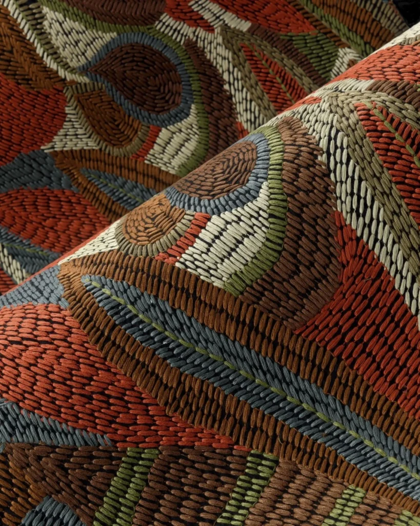
When we talk about making a room feel “alive,” texture is our most powerful tool. For this, @artewalls (Arte International) is my absolute go-to for London residential projects. Arte specialises in sophisticated, 3D textures that do more than just look good—they physically dampen sound, making a large, echoing room feel intimate and acoustically soft. Where to use it: Master bedrooms and media rooms where comfort and acoustics are paramount. Trend Watch: Look for their thermo-formed collections which offer a tactile relief you simply have to touch.
3. The Drama: Fornasetti as Art
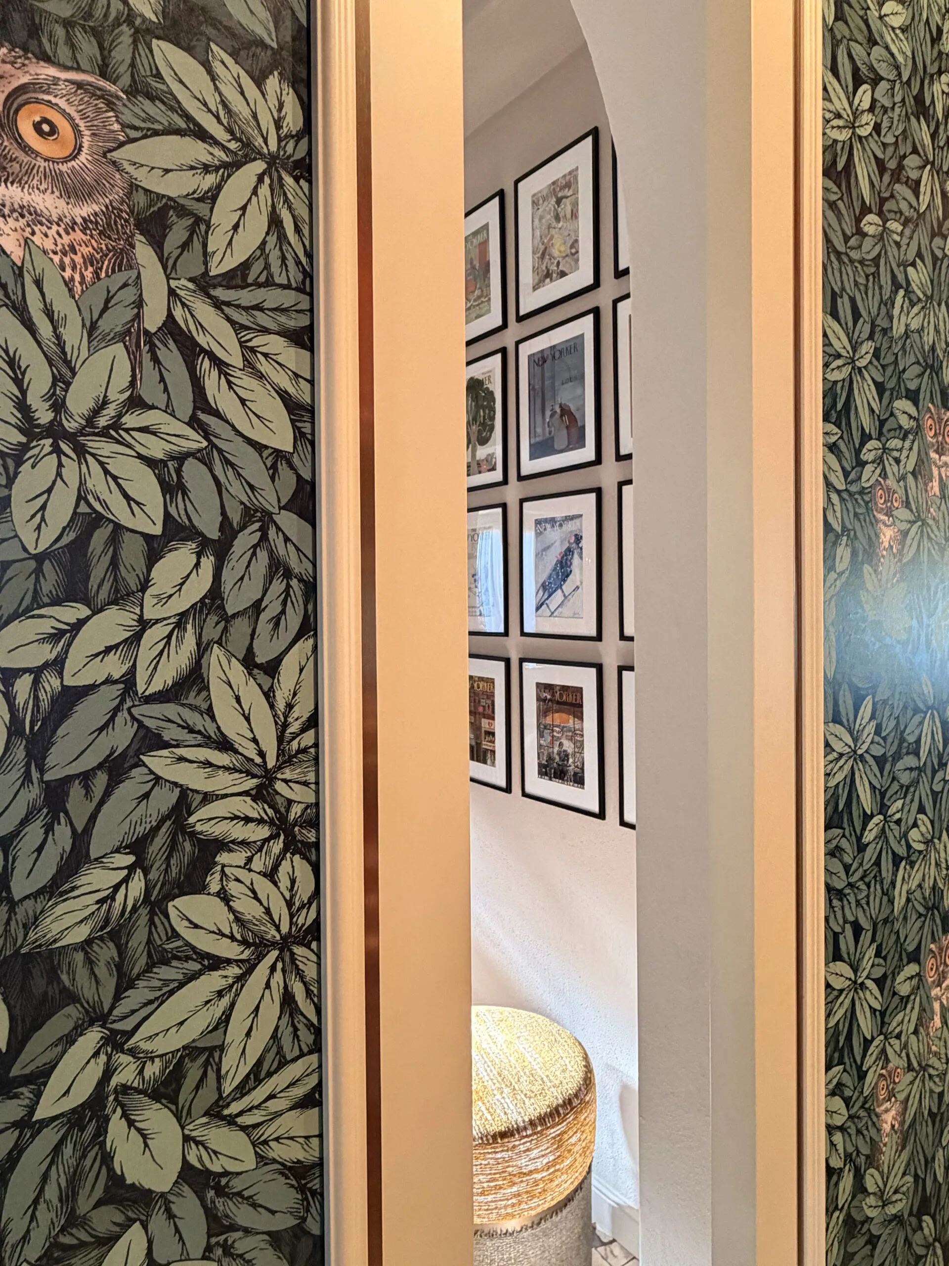
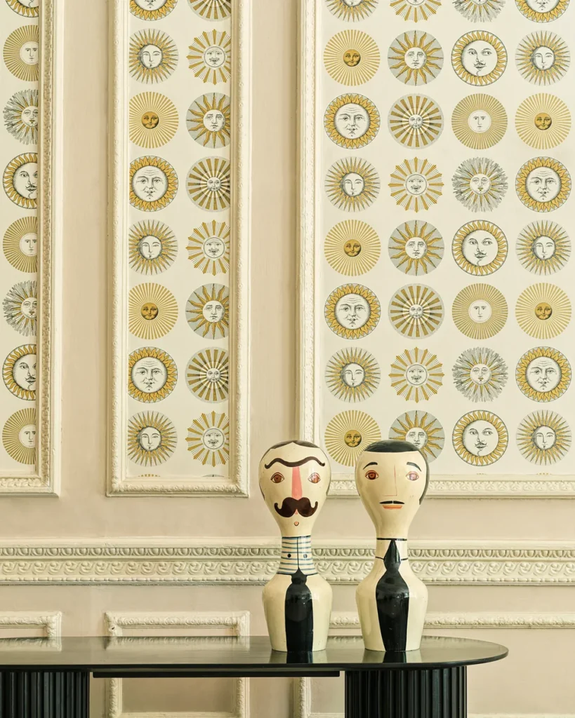
Sometimes, a wall shouldn’t just be a background; it should be the main event. @fornasetti is not just decor; it is Italian art history. Their whimsical, surrealist prints featuring architectural details, faces, and celestial motifs transform walls into “jewel box” experiences. Where to use it: Powder rooms (guest WCs) or inside walk-in joinery. These are small spaces where you can afford to be bold without overwhelming the eye. Design Tip: Treat Fornasetti paper like a mural. Do not hang artwork over it; let the paper be the art.
4. The Grounding: Quiet Luxury with Phillip Jeffries
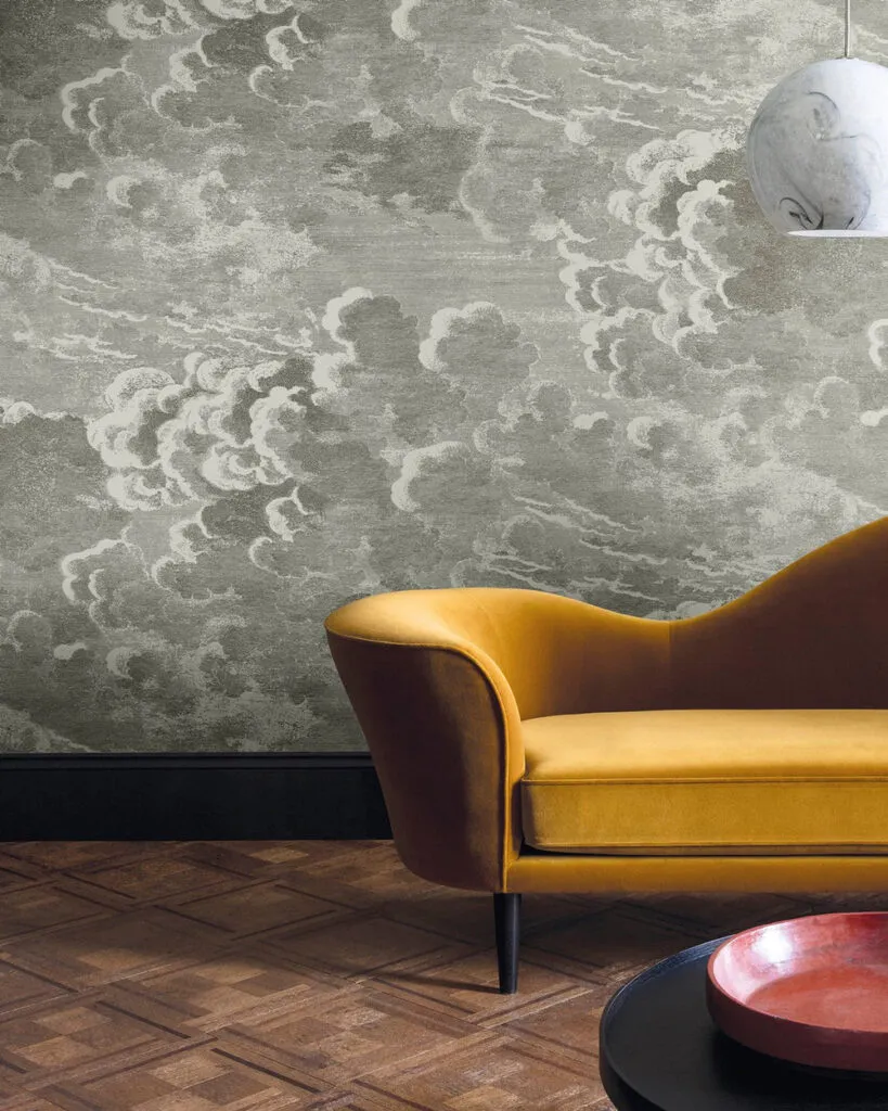
If your aesthetic leans towards the “Old Money” or “Quiet Luxury” trend that is dominating London interiors, @phillipjeffriesltd is the industry standard. They prove that natural fibers—specifically grasscloth, silk, and raffia—are the ultimate form of understated elegance. Where to use it: Living rooms and home offices. The organic irregularities in the natural fibers add a grounding, earthy element that connects the interior to the natural world. Why it works: It provides a neutral backdrop that feels expensive and curated, rather than stark and cold like a white painted wall.
The Pro Checklist: How to Select the Perfect Wallpaper
Before you commit to a purchase, run your choice through my professional checklist to avoid costly mistakes.
1. Sample It in Situ
Never buy off the internet or a showroom floor alone. Order a large sample and pin it to the wall you intend to paper. Observe how the colors shift from the cool, blue light of a London morning to the warm, artificial light of the evening.
2. Check the Scale
Scale is critical. Large Patterns: excellent for expanding a room and blurring the boundaries of the walls. Tiny Patterns: can look busy and clutter a space if not used carefully. Rule of Thumb: In a small room, be brave and go big. It sounds counter-intuitive, but a large-scale print can actually make a small powder room feel grander.
3. The Flow Check
Your home is an ecosystem. Ensure your wallpaper “speaks” to the paint or finishes in the adjacent room. If your hallway is papered in a warm grasscloth, ensure the living room paint color shares that same warm undertone to create a seamless transition.
Which Style Calls Your Name?
Are you The Storyteller (Fornasetti), The Tactile Soul (Arte), or The Modern Minimalist (Phillip Jeffries)?
Designing a home is about telling your story. If you are looking to transform your London property with high-end wallcoverings and bespoke design, contact Paolo Rota Interiors today for a consultation.
“ Don’t just paint a room, tell a story ”
PAOLO ROTA
Continue reading
 Architecture · 6 min readPop Art & Luxury Furniture Procurement for Bespoke InteriorsRead article
 Architecture · 5 min readTimeless Italian Craftsmanship: How Gubbio’s Heritage Shapes Luxury Interior DesignRead article
 Architecture · 5 min readHomo Faber & Bespoke Italian Craftsmanship | Paolo RotaRead article